Luglio 2024
Providing the Best UX Possible in Your Online Fashion Store
Ester Bazzanella

Whether consciously or subconsciously, when you walk into a clothing store you’re taking note of several things, things like how clean and organized the store is, if the staff are friendly and available, and even the store’s smell and music. Together, all these factors determine what kind of an experience you have. But online, things are a little different.
The experience users have shopping from you comes down to your online fashion store’s user experience (UX). And making for a good online shopping experience is all about optimizing your online store’s UX.
In the same way that you would keep a physical store clean and tidy, well-organized product pages and intuitive navigation makes it easy for shoppers to find what they’re looking for and complete their purchase.
Optimizing your online store’s UX is about removing any friction that keeps users from completing a purchase. From the moment users first land on your website to selecting products and completing the checkout page, the fewer obstacles in the way of their purchase, the better.
In this article, we’ll go over some key points to ensure that your online fashion store’s UX is as seamless as possible.
Make navigation easy
In a physical store, customers walk around to find what they’re looking for. If they have trouble finding something, they can ask an employee. In an online store, shoppers find what they’re looking for by navigating pages and menus. And instead of store employees to help them find what they’re looking for, there’s a search bar.
Making navigation easy for users comes down to how you group products, menu design, and the filter options available to narrow down searches.
Grouping products
There are a number of ways to group products in your online store to improve the user experience for shoppers. Think of how products are organized in physical stores, you wouldn’t expect to find mens jeans displayed together with girls sweaters. Online the same logic applies.
At the most general level, garments are typically separated by mens, womens, boys, and girls clothing. Within those categories products are sorted based on garment type, e.g., pants, shirts, sweaters, shorts, outerwear, etc. If you sell multiple brands in your online store, it’s also a good idea to sort products by brand.
Simple menu design
Once you’ve sorted your product pages by garment type and brand, make sure your product categories are easy to find in your store’s menu.
Start with the broadest categories and then use dropdown menus to display subcategories. Using dropdown menus that only appear when users hover over a particular option helps keep your menus clean and simple, while also not overwhelming shoppers with more options than they’re interested in.
Filter options
Imagine a shopper browsing the sale items in your online fashion store. The shopper is excited to take advantage of the sale to purchase some items they’ve had their eyes on. They may browse a few product pages only to discover that none of the products are available in their size. Without the option to filter by size, our imaginary shopper may get frustrated before finding a product in their size and give up on their purchase altogether.
This is why you need to provide your shoppers with filter options to quickly sort through products and search results. No one wants to click through countless pages to find the color or size they’re looking for.
Typical filter options include color, size, material, and brand, but there are myriad of options depending what kind of apparel you sell. For example for sports brands, it probably makes sense to allow users to filter garments by sport.
Remove any friction at checkout
Once ready to make a purchase on your site, you don’t want shoppers to abandon their cart because of a complex checkout page.
Here are some best practices to keep things fast and easy for your shoppers:
- Allow for guest checkout as many shoppers don’t want to have to create an account on every online store they shop from.
- A lot of people are still hesitant to enter their credit card information online, to address this, offer multiple payment methods like PayPal, ApplePay, or Venmo. This helps build trust while also making things easier for people who would rather check out with a payment method they already use.
- The more boxes a user has to fill in, the more likely they are to give up entirely. For this reason, don’t ask for any unnecessary information on your checkout page. Keep things simple and only ask users to provide the information necessary to complete their payment and deliver their products.
Audit your microcopy
Microcopy is the little bits of text that appear in forms, buttons, error messages, and menus online. Microcopy provides instructions for users and clarifies what actions need to be taken in the event of an error.
Functional, well-crafted microcopy can help drive conversions and reduce customer service tickets.
Keep microcopy functional
Confusing or wordy microcopy can keep users from performing their desired action in your online store. Use simple and succinct language in your online store’s microcopy so that all users will understand what needs to be done.
An error on a checkout page or difficulty signing are issues that can be easily addressed as long as users know how to resolve them. However, if the microcopy is unclear they can become roadblocks that lead to many shoppers abandoning their carts. Effective microcopy can often avoid these errors and thus drive conversions.
Keep microcopy on brand
Branding is essential for online fashion stores and your brand should shine through in all your communication on your website, emails, and social media.
While microcopy is most effective when messages are simple and short, that doesn’t mean you can’t inject a little personality in them. Engage shoppers by writing microcopy in your brand’s voice and keeping it consistent across your site.
Implement tools to improve your online store’s UX
Look for specific systems and tools that you can implement in your fashion e-commerce store that improve the user experience. The better the experience shoppers have on your site, the more likely they are to purchase.
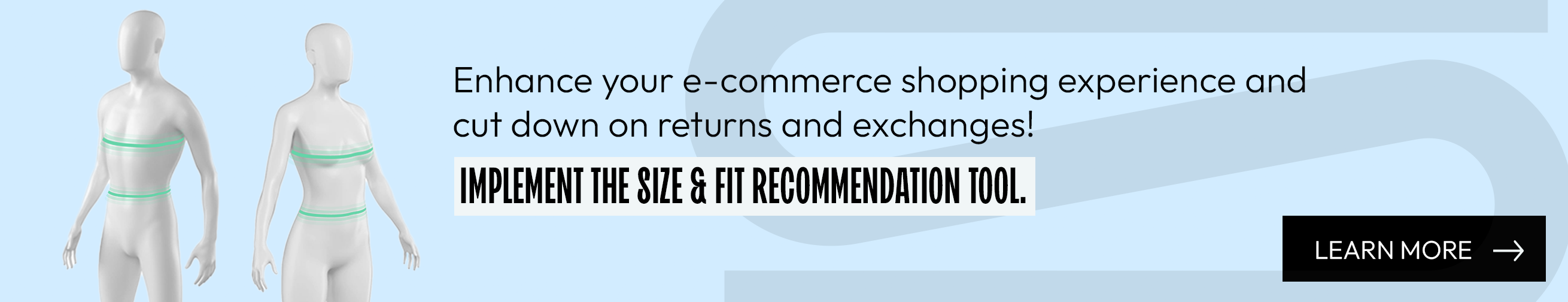
Size recommendation tool
As the name suggests, size recommendation tools help shoppers pick out the right size.
The number one reason for returns and exchanges in online apparel retail is incorrect sizing. Uncertainty about sizing is also to blame for a lot of abandoned carts. If you can help shoppers pick out the right size, you can increase conversions and decrease returns.
To receive a size recommendation, users typically have to enter their height, weight, and age. Size recommendation tools use either statistical or anthropometric models.
Statistical models compare the user’s inputted data with exchange and return rates of past users with similar data. This means that shoppers are recommended the size that they are least likely to return or exchange based on past purchases.
Anthropometric models use body measurement driven algorithms to provide accurate information about how different sizes will fit. This means shoppers are recommended sizes according to their individual body shape, and can more confidently pick a size based on their personal style preferences.
Product recommendation systems
Keeping users on your site for longer increases the chances of them making a purchase. Recommending products they might like is one way to serve them with relevant content and keep them engaged.
Like recommendation algorithms on social media, product recommendations ensure that shoppers see items that they are likely to enjoy. According to McKinsey & Company, 35% of Amazon purchases are thanks to product recommendations.
Product recommendation recommendation tools generally fall into one of three categories: collaborative filtering, content-based filtering, or hybrid systems.
Collaborative filtering is based on the behavior and preferences of similar users or characteristics of similar items.
Content-based filtering focuses on the attributes of the products themselves, suggesting items with similar design, color, and style.
Hybrid systems combine both approaches to provide more accurate and relevant suggestions.
Properly depict your products
Shoppers need to get a good idea of how pieces fit and feel without being able to touch them, try them on, or ask employees about materials and fit.
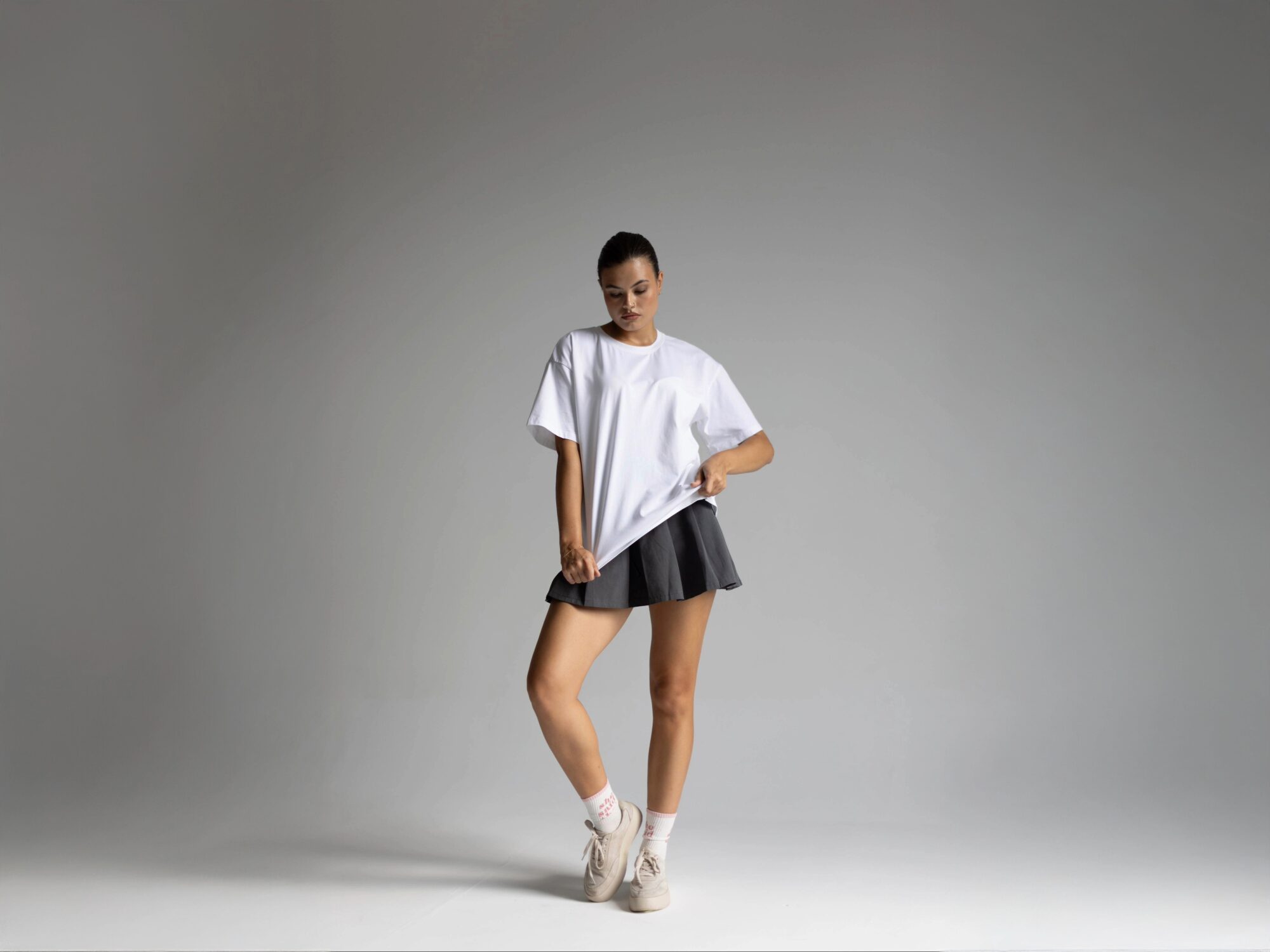
To this end, in your online store you’re limited to product descriptions and photos. Be sure to include any relevant information relating to materials, design, and fit that will help shoppers understand products without physically touching.
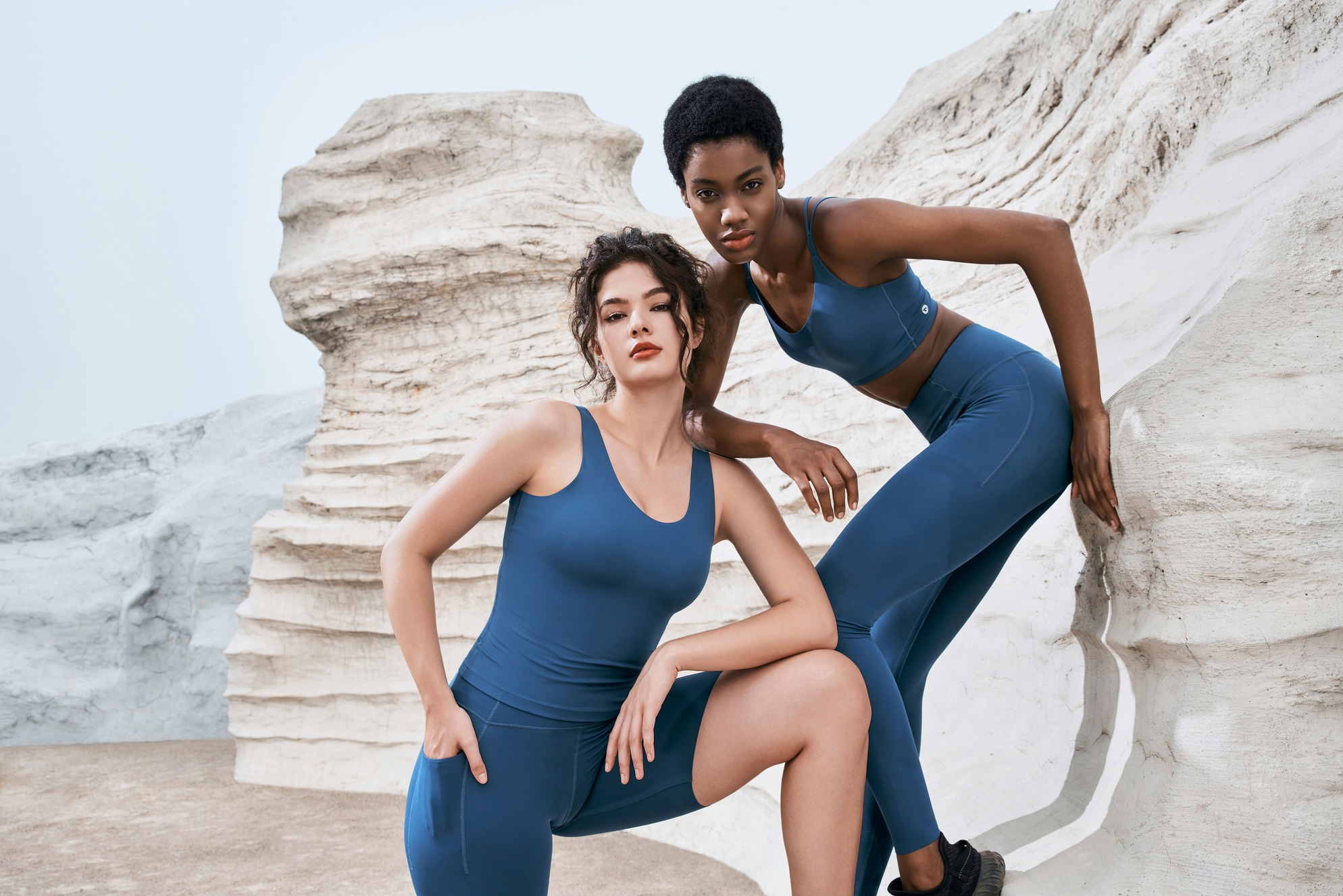
This goes without saying but product pages also need to include high quality photos of garments. Include photos of your garments as well as photos of models wearing them so shoppers can see how they fit on the body.
Make shopping easy
Improving the user experience of your online store is all about making it as easy as possible for shoppers to find what they’re looking for. People tend to have little patience while browsing online, and any hiccup on their buying journey is enough for them to abandon their purchase.
Improving your store’s UX is just one way to increase conversions, for other tips make sure to read our article with 5 tips on how to sell more clothing online.