November 2025
E-Commerce Visual Merchandising: Design Your Online Store Like a Pro
Ester Bazzanella
To walk into a new clothing store, something needs to appeal to shoppers while they’re walking down the street or in the mall. Typically, it’s the clothes in the window display or the store’s aesthetic.
When they walk inside, they instantly know if it’s a store for them. The layout, the lighting, the way the products draw them in. That’s visual merchandising at work. Now, imagine that same experience online.
In e-commerce, your website is your store. Your homepage is your window display. Your website design the lighting. Everything from your homepage banners to your product photography and checkout flow shapes how customers perceive your brand, and whether they buy.
In this guide, we’ll show you how to translate the best in-store merchandising strategies into a digital experience that keeps customers browsing, buying, and coming back.
What is visual merchandising in e-commerce?
E-commerce visual merchandising is optimizing and designing your online store in a way that encourages browsing and buying. It’s the digital version of the perfect in-store experience.
But how can you attract customers online without window displays and interior design?
Through your website’s design and performance, product photos and descriptions, and fluid checkout experiences. Your store’s online shopping experience is critical to building shopper confidence and keeps shoppers on your website for longer. More engagement tends to equal more sales.
It’s also a brand building tool. Your digital storefront is where you have full control over your brand story. You can create opportunities to connect with shoppers, and give them reason to keep coming back.
Why is e-commerce visual merchandising important?
Because first impressions matter.
And in e-commerce, your website determines what that first impression is. Humans are visual creatures, and online visual cues are the biggest determinants of how much we trust a store, how stylish we think a brand is, and if we’ll be buying anything.
Here are some examples of e-commerce visual merchandising in action:
- A professional design with trust signals influences how comfortable shoppers feel entering their credit card information on your website.
- Multiple payment options can decrease your cart abandonment rate.
- Showing customers personalized product recommendations keeps them browsing for longer and encourages higher order values.
- Advanced product filtering and image search let shoppers find exactly what they’re looking for. Even if they don’t have the words to describe it.
- Shoppers form a strong opinion about your brand based on their experience online and what they learn about your brand from your website.
With all that said, let’s take a look at how you can design your online store for success.
Design Your Site Like You Would a Brick-and-Mortar Store
The easiest way to think about e-commerce visual merchandising is to design your online store as if you were designing a brick-and-mortar store. Ask yourself:
- How can you attract shoppers to your store?
- How can you make sure they find what they’re looking for?
- How can you create opportunities to upsell at checkout?
- How can you keep shoppers engaged after their purchase?
With those questions in mind, let’s examine the entire shopping journey and how you can optimize every step.
Getting Shoppers In the Door
Customer mindset: “What kind of store is this? Does it appeal to my style?”
Think of your homepage as your storefront window display. If it were a physical store, it’s what would make shoppers interested in stepping into your store. In other words, your homepage should stop shoppers in their tracks.
A clean layout and intuitive navigation help orient new visitors right away, just like clear signage in a mall. Seasonal storytelling, whether it’s a summer collection or a fall refresh, sets the mood and shows that your store is alive and in tune with trends.
High-quality hero images act like those perfectly styled mannequins up front: they capture attention, spark curiosity, and reflect your brand’s aesthetic. Consistent branding ties it all together, reinforcing trust the way a well-designed physical space makes you want to step inside.
Your objective here is to create an initial connection with shoppers. You want them to identify with your brand right away. You need to make sure shoppers don’t bounce right away and continue browsing.
Practical strategies:
- Feature high-quality hero banners with seasonal or trend-based visuals.
- Show top-level product categories using clear, clickable visual tiles.
- Use “New In,” “Best Sellers,” or “Style Edits” blocks to promote collections.
- Match homepage visuals to campaign messaging in emails and ads.
Helping Shoppers Find What They’re Looking For
Customer mindset: “I want to explore what they offer or find something specific.”
Once inside a physical store, customers may start wandering around. Or maybe they beeline straight to what interests them.
Online, that means providing clear category pages, comprehensive filtering options, logical menu hierarchies, and smooth navigation. These are what help your shoppers who are just browsing find what interests them. Your job is to be the helpful associate who knows exactly where everything is.
For shoppers who know exactly what they’re looking for, your job is to make it as easy as possible for them to find it. Your search bar is the digital version of customers asking, “Can you show me where to find this?” Make sure it delivers fast, accurate results with helpful filters like size, color, and style.
Product pages should be detailed enough to deliver keyword matches to customer searches. Additionally, allowing for image search is another way to help customers in their search. It’s perfect for shoppers who would ask, “Do you have something that looks like this?”
Personalization takes this all a step further: show shoppers relevant products or collections based on what they’ve browsed. It’s like noticing a customer linger near the denim wall and suggesting the newest fit.
Practical strategies:
- Create visually clean category pages with banners or themed headings.
- Enable filtering by size, price, color, fit, etc. with sticky filters.
- Highlight trending, bestselling, or new items near the top of pages.
Letting Shoppers Understand What They’re Buying
Customer mindset: “Let me look more closely at items I might like.”
In store, this is where customers touch fabrics, feel textures, and inspect stitching. Online, imagery does all the heavy lifting. Use crisp, high-resolution photos and videos that capture details, movement, and true colors.
Show your products on real people or in context so shoppers can picture how that piece fits into their life. User-generated photos and reviews give another layer of authenticity, it’s like overhearing other shoppers rave about how great something looks in person.
Practical strategies:
- Show products on diverse models with zoomable, high-res images.
- Write detailed product descriptions.
- Use video to show how fabric fits and flows.
- Display customer reviews and visual user-generated content (UGC) on product pages.
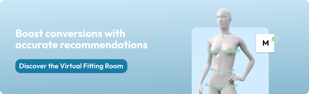
Give Shoppers A Fitting Room
Customer mindset: “I like this! Is it right for me? What size should I order?”
Every shopper wants that “this fits perfectly” moment. In-store, that happens in the fitting room; online, it’s all about fit information and tools.
Size charts, fit guidance, and virtual fitting rooms help close that confidence gap. Use this space to suggest complementary “complete the look” items that feel like a friendly stylist’s recommendation. Reviews, size feedback, and star ratings reinforce that others found the right fit too, giving new shoppers the assurance they need to hit add to cart.
Practical strategies:
- Implement a virtual fitting room or size recommendation tool.
- Make detailed size charts available for all products.
Read more: The Ultimate Guide to Clothing Size Charts for Fashion E-commerce
Getting Customers to the Cash Register
Customer mindset: “I’m going to buy this, is there anything else I want?”
At this stage, think of your cart as the checkout counter. Smart upselling and cross-selling are the online equivalent of the accessories rack beside the register: they add value without feeling pushy.
Reinforce trust through visible security badges, clear return policies, and familiar payment logos. These cues reassure shoppers the way a friendly cashier and a sturdy shopping bag would. Keep the visual design consistent through checkout so nothing feels out of place; friction breaks the spell faster than a long line at the register.
And make sure to offer multiple payment options. A physical store that only accepts cash or doesn’t accept credit cards is turning away customers. The more payment options you can offer, the less likely shoppers are to abandon their cart.
Practical strategies:
- Maintain consistent design from product page to checkout.
- Use progress indicators and image thumbnails in carts for reassurance.
- Accept multiple payment methods.
- Make checkout as fast and easy as possible.
Read more: Optimizing Checkout in Fashion E-commerce
Bringing Shoppers Back In
Customer mindset: “I might shop here again. Was this experience worth repeating?”
The journey doesn’t end when the package ships. Just as a brick-and-mortar store might invite you back with a loyalty program or email, your post-purchase touchpoints should carry the same polish.
Beautiful order confirmation emails, consistent branding, and thoughtful follow-ups reinforce the positive experience. Encourage shoppers to share UGC on social media, turning satisfied customers into ambassadors. Then, use their purchase data to personalize future recommendations, like a stylist remembering your size and favorite color the next time you visit.
Practical strategies:
- Send thank-you emails featuring visuals of purchased items.
- Encourage sharing or reviewing with embedded product images.
- Recommend complementary items or seasonal looks based on order history.
Put Visual Merchandising to Work
A huge part of e-commerce visual merchandising is just making sure you have a beautiful-designed website. But equally important is your store’s user experience. How easy it is for shoppers to find exactly what they’re looking for, confidently determine their size, and quickly check out?
When every element, from your homepage to your checkout, works together it tells the right story and builds confidence in shoppers. It creates the kind of experience shoppers want to return to.
Think like a store designer, act like a storyteller, and let your visual merchandising do what it does best: turn casual browsers into loyal customers.
If you’re looking for more tips about how to optimize your store’s user experience, be sure to read out article about providing the best possible UX in your online fashion store.