April 2024
Making Your Online Apparel Store More Accessible
Ester Bazzanella

Accessibility is about empathy. It’s being able to put yourself in someone else’s shoes and understand their situation. It’s about ensuring that everyone, regardless of ability, can engage with your brand, content, and products seamlessly.
Digital accessibility matters. We all deserve to use web services and experience the web in the same way, regardless of disability or temporary impairment.
What accessibility online looks like
Accessibility in the physical world is something most people are familiar with, but what does accessibility mean online? If you’ve never needed them, it can be hard to imagine what kinds of tools exist to make navigating accessible for people with impairments.
Common accessibility services online include:
Visual accessibility services: Visual disability can range from visual impairments that can be corrected with corrective lenses, to total blindness in one or both eyes. People can also have a hard time distinguishing, or have reduced or increased sensitivity to, specific colors. Addressing these impairments online can involve alt text for images, optimizing color contrast, and avoiding embedding words in images.
Physical accessibility services: People with physical disabilities who can’t use a mouse or touchscreen may be limited to navigating your website with a keyboard. Here, accessibility takes the form of implementing keyboard navigation, making sure buttons and links are easily clickable, and providing sufficient time limits to fill out forms.
Cognitive accessibility services: Cognitive, neurological, and learning disabilities affect how well and easily people understand information. Making sure people with these disabilities understand your content means using clear and concise language, structuring content clearly, breaking up text with images and charts, and avoiding distractions.
Auditory accessibility services: Content can be provided visually to be accessible for users with auditory disabilities, but this requires captions and transcripts to be truly accessible. Making sure important information can be accessed visually, through simple text and images, as well as through sign language is vital.
And accessibility is not just limited to permanent impairments. For example, a mother holding a child may have a temporary physical impairment, in that she only has one hand available to browse the internet on her smartphone. Similarly, people commonly find themselves in situations in which they cannot access audio content.
Accessibility can also refer to responsiveness, i.e., webpages that respond and adjust to the screen size of devices, and quick load times to make content accessible for users with slow internet connections.
Accessibility compliance online
Making web content accessible, beyond an empathetic practice and good for brand reputation, is also a mandatory legal compliance in many parts of the world.
In the US, businesses and governments must comply with the Americans with Disabilities Act’s “general requirements of nondiscrimination and effective communication”. While there’s no regulation that sets out specific standards for web accessibility, there are existing technical guidelines to help ensure that services provided online can be accessed by people with disabilities.
Guidelines include the Web Content Accessibility Guidelines (WCAG) and the Section 505 Standards.
Improving the accessibility of your online apparel store
Let’s take a look at what accessibility means practically, and best practices you can implement in your online apparel store.
Remember that the goal of accessibility is to provide all users with the same access and experience when browsing the web. With that in mind, some of the best practices we’re going to list here relate to design while others are specific accessibility tools.
If you need help throughout this process, there are tools online that make it easy to make your website more accessible. Site Improve, for example, is a Chrome extension that rates websites on how accessible they are according to ADA compliance.
Responsiveness
The majority of internet traffic around the world comes from mobile devices. Mobile devices with varying sizes and screen resolutions.
Responsiveness refers to how websites and their content respond, or adjust, to the size of the screen they’re being displayed on. In other words, whether shopping from a small or large screen, your clothing needs to look great for shoppers!
You need to make sure that your shoppers have a consistent and enjoyable browsing experience across devices. Any hiccups in the experience of navigating your website could lead to abandoned carts or low conversion rates.
Load time
Like responsiveness, load time is also considered a best practice for optimizing your user experience in general. In the realm of accessibility, load time is important as it ensures all browsers have the same access to content regardless of internet connection speed.
Fast load times are especially important for mobile users. Mobile users are often shopping while commuting or performing other tasks, and as a result tend to bounce faster than desktop users.
Text size
Online, shoppers can’t physically feel or try on clothing while shopping. That means stores need to find other ways to make up for those experiences. A well-written product description can give shoppers a good idea of the look and feel of a garment without touching it.
And if you have well-written product descriptions, make sure everyone can read them!
Using adequate text size is critical for users with visual impairments or that have trouble reading small text. Increasing text size greatly improves readability and makes it easier for all users, even those without visual impairments, to read and navigate content without straining their eyes.
The WCAG recommends that users “should be able to increase text size on your page by up to 200% without the page display messing up or having text overlap with other text or elements.”
Color contrast in elements
Color contrast is important to distinguish web elements. For users with visual impairments or browsing from low-resolution screens, color contrast ensures readability of content.
In product photos, using contrasting backgrounds ensure that users are able to properly see the fit and fall of your store’s garments.
Color contrast is expressed as a ratio between the luminance values of text and background color. The WCAG recommends a minimum contrast ratio of 4.5:1 for normal text and 3:1 for large text.
Make sure to keep contrast in mind in early stages of design and maintain it across all pages to maintain accessibility.

Enhanced iconography to express states
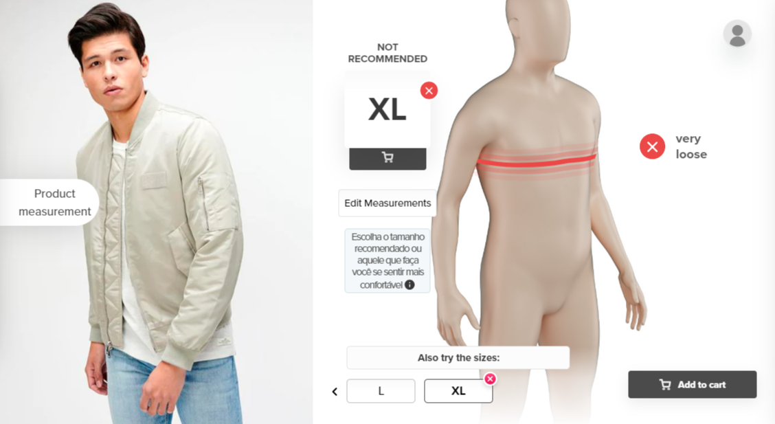
Daltonic users, or users that have trouble distinguishing color, can have a hard time navigating when states are solely expressed with colors like red and green. Using icons to express states together with colors, reduces confusion and enhances user experience.

Using Xs and checks is a great way to represent true/false states beyond just colors.
Keyboard navigation
Being able to navigate web pages with a keyboard, and not a mouse, facilitates browsing for users with motor impairments. For keyboard navigation, it’s important to prioritize tab order, content structure, and easy keyboard commands and shortcuts.
With the keyboard focus element, allows Sizebay users to navigate through the size recommendation experience with a keyboard.
Voice over readers
Voice-over readers, or screen readers, are tools that convert digital content into audio or Braille output for users with visual impairments. Two common tools are VoiceOver for Mac and ChromeVox by Google.
Sizing and Accessibility
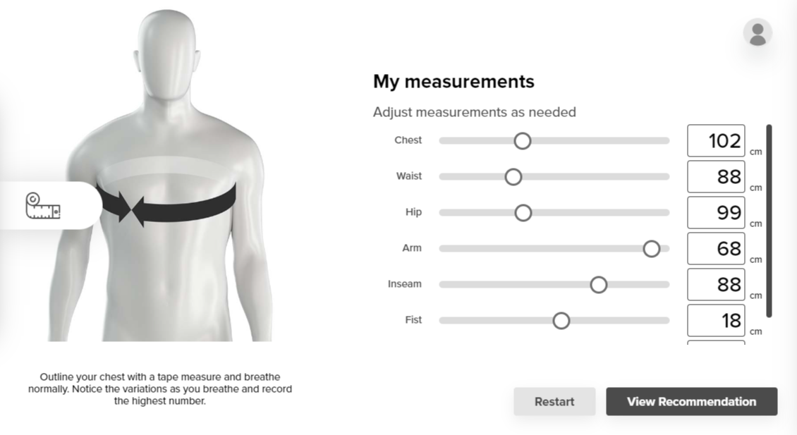
When it comes to helping shoppers pick out the right size online, size recommendation tools are critical. While most brands have a size chart on their website, they’re only useful for users who have access to a measuring tape.
That’s why size recommendation tools are a much more accessible solution for shoppers to determine their size.
If you do use a size recommendation tool on your online apparel store, make sure that the tool itself is accessible. In other words, the tool’s forms and pages should have all the features we’ve outlined in this article.
Sizebary’s Size and Fit Advisor is very accessible for shoppers as it only requires them to input their height, weight, and age to provide accurate size recommendations. On top of that, our tool is fully ADA compliant and we’re always looking for ways to improve the accessibility tools available.
For a more empathetic world
Whether people have a disability or temporary impairment, everyone deserves to have full access to the web. And shopping for clothes online is no different!
If you’d like to learn more about improving the user experience for your shoppers, learn about how your mobile experience affects sales.


