March 2024
How the Mobile Experience of Your Online Apparel Store Affects Sales
Ludimila Borderes

Smartphones have changed how we browse the internet.
In the last quarter of 2023, 58.67% of global internet traffic came from mobile devices. With so many people using mobile devices as their primary means of browsing the internet, they’ve come to expect optimized mobile experiences. Users have little to no patience for clunky or slow mobile websites. This is especially true when shopping for clothes online. When users browse online apparel stores from their mobile devices, they need to be met with convenient, fast, and efficient shopping experiences that have been optimized for mobile browsing.
In this blog post, we’ll discuss the significance of mobile optimization, explore why e-commerce apparel stores need to cater to the growing number of mobile-first users, and some key principles to keep in mind.
The Rise of Mobile Shopping
In 2023, global mobile e-commerce sales reached 2.2 trillion dollars, representing 60% of all e-commerce sales worldwide. In the US, mobile e-commerce sales reached more than 491 billion dollars.
With so many people shopping online from their smartphones, it’s clear that mobile shopping has become a dominant force in the e-commerce landscape. At this point, choosing not to invest in your apparel store’s mobile experience doesn’t make sense from a business perspective.
Consumers are no longer as reluctant to shop online as they used to be, but buying clothes online still presents many barriers to purchase. In the case of mobile clothes shopping, the experience presents its own unique set of challenges that need to be overcome to convert users into buyers.
By optimizing for mobile, e-commerce apparel stores can greatly increase their sales by tapping into the vast market of users who prefer the convenience of shopping from the palm of their hand.
Understanding User Profiles: Desktop vs. Mobile
To optimize your online store’s mobile experience, it’s important to first understand how people browse the internet differently based on the device they’re using. Let’s take a look at some of the key differences between mobile and desktop browsing that will influence how you design and optimize your mobile experience.
Device limitations
Mobile devices have smaller screens and tend to have less processing power than desktop computers. As a result, mobile websites need to have simpler interfaces and faster loading times. According to Google, 53% of mobile sites are abandoned if they take longer than 3 seconds to load.
Context
Mobile users are often on the go and multitasking, which inevitably influences their purchasing behavior. Simple and intuitive interfaces are essential since mobile users will be quick to give up on a purchase if navigation isn’t fast and user friendly.
In the case of users who are shopping on the go, special attention needs to be made when it comes to sizing. Whereas users shopping from home may have access to a measuring tape and/or other clothes they can reference for sizing, mobile shoppers don’t have that same luxury. This makes it critical that your online apparel store includes a method for customers to quickly and accurately determine the right size to order without the need for any measuring. This could take the form of a size chart that lists recommended height and weight ranges for each of a garment’s sizes, a size recommendation tool, or, ideally, both.
Payment methods
Many mobile users may prefer to complete purchases using mobile payment methods, like Google Pay or Apple Pay. Since payment information is already stored on their device, it makes it easier for users to complete purchases quickly.
Providing mobile payment methods ensures that mobile users won’t abandon their carts because they have to enter their credit card information. Mobile payment methods help convert mobile users and are in line with the fast and convenient experience shoppers have come to expect from mobile browsing.
A seamless experience with social media

One of the most important reasons for optimizing your apparel store’s online experience is to seamlessly integrate it with social media.
Social media platforms have become one of the best places to advertise and market products, especially clothing which is highly dependent on visuals. Given this, many consumers’ first contact with your brand will be via social media, whether they find your profile organically or through targeted advertising.
Leveraging social media platforms as marketing channels becomes more effective when the online apparel store’s mobile experience is optimized. With mobile-optimized product pages and seamless integration with social media, targeted advertising campaigns on platforms like Instagram and Facebook can drive traffic directly to your mobile site or app, leading to increased sales and conversions.
And since the vast majority of social media users access platforms from mobile devices, if they access your website from your brand’s social profiles, they’ll be accessing your mobile site first. A mobile-optimized website or app not only enhances the overall shopping experience but also facilitates interaction with social media, driving engagement, traffic, and sales.
Embracing Mobile-Friendly Design
Optimizing for mobile is not just about fitting your website onto a smaller screen; it’s about creating a user-friendly design that prioritizes mobile interactions. From responsive design elements to streamlined navigation menus, every aspect of your mobile site should contribute to a cohesive and enjoyable shopping experience.
Let’s take a look at some key principles to keep in mind to provide the best possible mobile experience.
1. Responsive design is key
In mobile web design, responsive design essentially just means that designs are fluid and adapt to different screen sizes. Instead of fixed grids, images, and elements, responsive designs are flexible to ensure the browsing experience is consistent regardless of the user’s device. A responsive design not only enhances user satisfaction but also positively impacts search engine rankings, contributing to improved visibility.
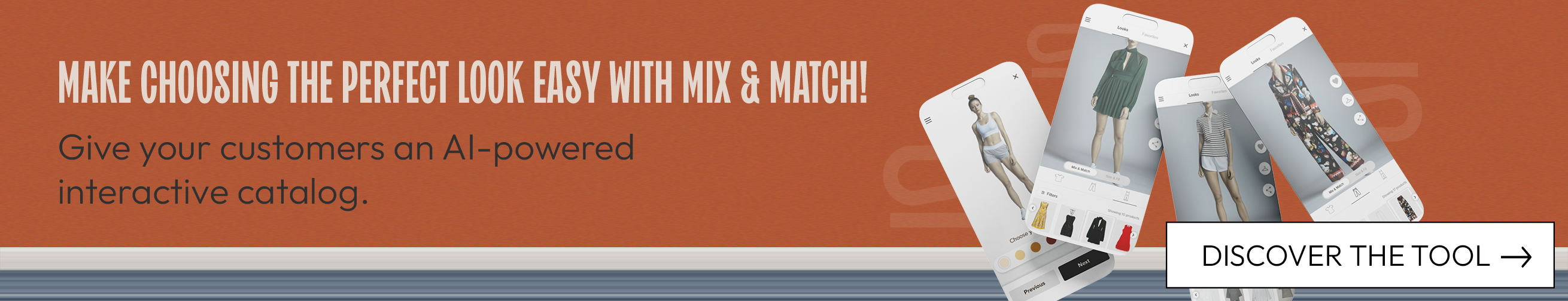
2. Keep navigation simple with intuitive menus and filtering
Make it easy for your users to explore your products and navigate your site with intuitive menus.
Menus should be well-organized and easily accessible so shoppers can quickly find what they’re looking for. Hamburger menus are a good option to keep designs clean and offer a great way to organize your products into clear categories.
Facilitate quick and efficient product discovery with easy-to-use filtering options and a search bar. Your product menus should also allow users to sort products based on size, color, price range, and other relevant criteria.
3. Optimize load speed
Mobile users expect pages to load fast. As we mentioned above, more than half of mobile users will abandon a page if it doesn’t load in three seconds. Optimize images, minimize HTTP requests, and leverage browser caching to ensure your pages load quickly. Tools like Google’s PageSpeed Insights can help identify and address speed-related issues.
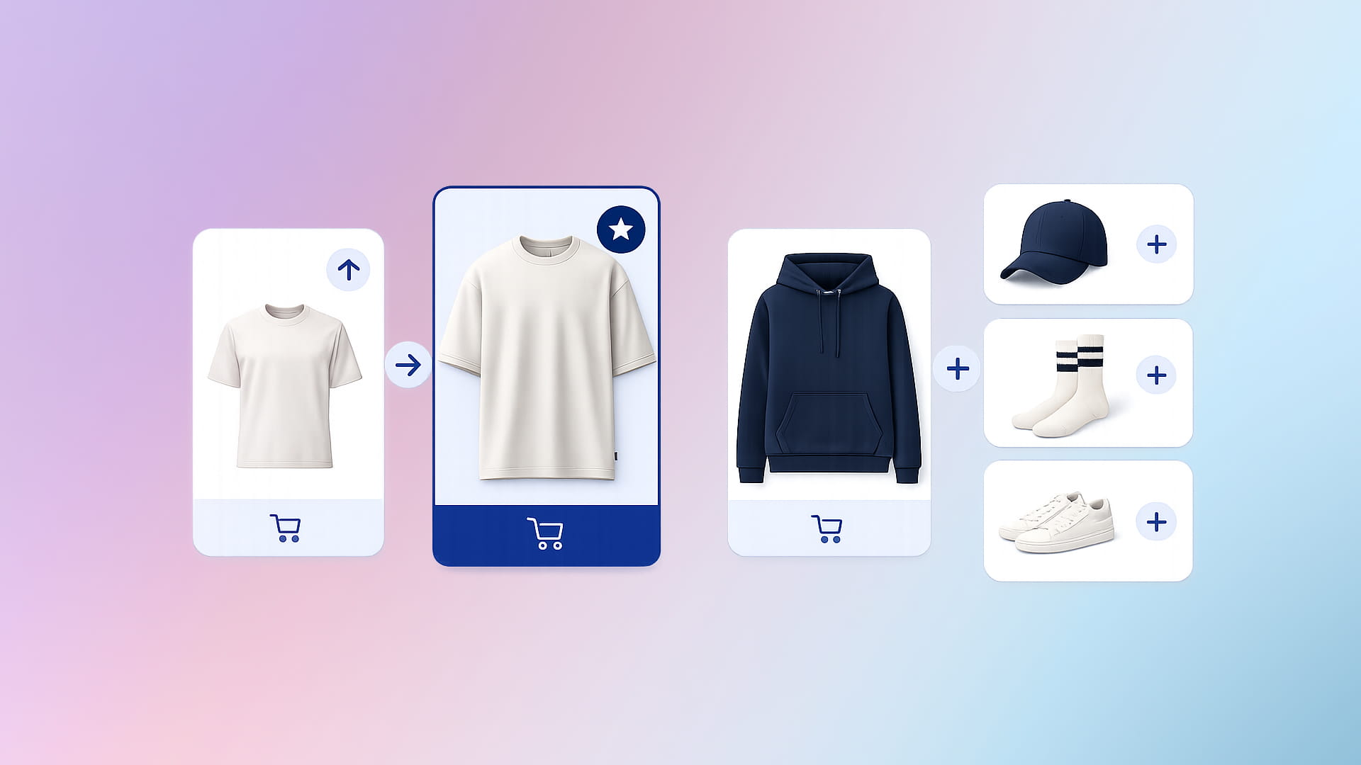
4. Mobile-friendly product displays
Make sure it’s easy for shoppers to navigate your product collections. Prioritize large product images, concise and compelling product descriptions, and easy-to-use swipe gestures for image galleries. When viewing product images, users need to be able to zoom in for a closer look at the details.
5. Simplify checkout
A complex and lengthy checkout process can lead to cart abandonment, even on desktop. Streamline the mobile checkout experience by minimizing the number of steps required. Checkout forms need to be easy to read and fill in on mobile. As we previously mentioned, make sure your mobile site allows for payment with mobile payment methods like Google Pay and Apple Pay.
Integrating Size Recommendation Tools
Helping shoppers pick out the right size is absolutely essential, whether they’re browsing the desktop or mobile version of your site. Incorrect sizing has been cited as being the number one reason for returns for 53% of shoppers, to upwards of 70%.
Traditionally, online apparel stores have used size charts to help shoppers pick out the correct size by listing garment sizes and the respective body and/or garment measurements. While they can be effective, they’re often not enough to guide shoppers and give them a good idea of how they can expect pieces to fit their body.
One of the biggest drawbacks of size charts is that they require measurements to be taken, and the majority of shoppers don’t have access to a measuring tape at home. If this is true for desktop users shopping at home, it’s especially true for mobile users who are often shopping while they’re not home.
For this reason, more and more retailers have turned to size recommendation tools to provide more accurate and effective size recommendations. In the case of mobile users, allowing shoppers to determine the right size without the need for measuring allows them to complete purchases on the go.
If consumers have to wait until they get home to take their measurements, it’s very likely that they’ll give up on their purchase altogether. And even if they do end up completing their purchase, there’s a good chance they’ll order the wrong size and have to make a return. Both of these scenarios negatively impact your revenues. By integrating a size recommendation tool on your site, you can increase conversion rates and avoid added costs involved in reverse logistics to complete returns.
Continuously Optimize and Improve
Optimizing the mobile version of your site lets you capitalize on the increasing number of consumers who shop from mobile devices. But as with anything when it comes to online e-commerce, make sure to continuously optimize your site.
Gathering user feedback, conducting user experience focus groups, monitoring performance metrics, and adapting to new mobile design advancements, will ensure that the mobile version of your website is user friendly and converts!