

Picture this: your store releases a new piece on a Monday. By Thursday, the size that sells out first isn’t the “average” size your buying team planned around. It’s a size on the edge of the curve. Meanwhile, the sizes in the middle sit in inventory for the rest of the season.
Your size curve just told you something you didn’t know about your customers. Pay attention. Predicting accurate size curves helps ensure popular sizes don’t sell out too fast, while also avoiding holding on to too much unsold inventory.
In this article, we’re covering everything you need to know about size curves, the data you need to analyze to get yours right, and other factors you need to take into consideration.
What Is a Size Curve?

A size curve is the distribution of demand across sizes for a given product. It answers the question of how many small, medium, and large units you should stock for every 100 units sold. Get that ratio right, and your buying, stocking, and merchandising decisions all line up with what customers actually want. Get it wrong, and everything downstream compounds the mistake.
Curves generally fall into a few shapes:
- Standard curve: demand spreads predictably across a range, common in basics and core styles.
- Skewed curve: demand concentrates heavily in one or two sizes, common in fitted or trend-driven pieces.
- Custom curve: shaped by a specific audience, region, or category, and doesn’t follow a generic template.
Most brands build their curve once, based on historical sales, and then reuse it season after season with minor tweaks. That’s a mistake. A size curve isn’t a fixed spec sheet. It’s a live signal of who your customers are and how their bodies and preferences are changing. Treat it like a report you build regularly, not a template you set and forget.
How often should we actually rebuild our size curve?
At least once a season, but don’t treat that as a hard rule.
If a return pattern shifts or a demand signal spikes mid-season, that’s worth acting on right away instead of waiting for the next planning cycle. For more on turning that cadence into a repeatable process, see our guide to seasonal buy planning.
Read also: 5 Tips to Prepare Your Fashion E-Commerce Store for the Changing Seasons
Is a size curve the same thing as a size chart?
No. A size chart tells shoppers how a garment fits, while a size curve tells you how many of each size to buy.
They’re related, but a broken size chart can throw off a perfectly reasonable curve, and a bad curve can exist even when the size chart itself is accurate. If you suspect your size chart is the root problem, start with our size chart audit checklist.
What Data Do You Need to Build an Accurate Size Curve?

Building an accurate size curve requires two layers of data: demand signals and friction signals, tracked together rather than in isolation. Most teams default to one number, units sold by size. That’s a start, but it only tells you what happened after inventory constraints, marketing spend, and a hundred other variables already shaped the outcome.
Demand signals show you what customers want, whether or not they got it:
- Most sold sizes (the baseline, but incomplete on its own)
- Most browsed or viewed sizes on product pages
- Sizes most added to cart, including abandoned carts
- Size guide and fit tool interactions, especially repeated checks before purchase
Friction signals show you where the experience broke down:
- Most returned sizes, and the stated return reason
- Return patterns split by “too small” versus “too large” versus “didn’t like the fit”
- Whether returning customers buy the same size consistently or bounce between sizes
Here’s why both layers matter. Imagine medium is your best-selling size for a product. On a sales report alone, that looks like a win. But if medium also carries your highest return rate for that SKU, the story flips: you’re not looking at a best seller, you’re looking at a grading issue quietly costing you fulfillment and shipping fees on every unit that comes back. Sales volume alone can’t tell “customers love this size” apart from “customers keep guessing wrong on this size,” which is exactly where most size curve calculations go wrong.
Stockouts make this worse. Once a size sells out in week one, every day after shows zero demand, even if it was your strongest performer. Skip that correction, and you’re teaching your buying model to repeat the mistake next season, since a curve built on stockout-distorted sales keeps underbuying the size that sold out fastest.
Why isn’t units sold enough to build an accurate size curve?
Because units sold only reflect what customers were able to buy, not what they wanted.
If a size sells out early, every day after that shows zero demand for a size that might have been your strongest seller. You need browsing, cart, and waitlist data to see demand that stock constraints hid from you.
What’s the fastest way to spot a size chart problem versus a real demand issue?
Layer your best-selling sizes against your most-returned sizes for the same SKU.
If a size is both your top seller and your top returner, shoppers are guessing wrong and hoping. Sales data alone can’t tell those two situations apart.
How to Track If Your Size Curve Matches Real Customer Demand
The most reliable way to check your size curve is a three-way comparison: what you stocked, how fast it sold, and unconstrained demand signals, not sell-through rate alone. Sales can never exceed what you stocked, so the gap between what you bought and what customers wanted is easy to miss.
Here’s why. A size that sells out in week one shows a perfect 100% sell-through rate, the best number on your report. But it might have sold three times as many units if you’d bought deeper. Both scenarios look identical on paper.
Run this comparison instead, by size:
- What you stocked
- How fast each size sold out (sell-through velocity)
- Unconstrained demand signals that don’t depend on stock being available, such as product views, size guide checks, and back-in-stock waitlist signups
A size that stocked lightly, sold out fastest, and shows high browsing or waitlist activity was under-bought, not weak in demand. Run that comparison every season, and the curve starts correcting itself.
The inverse matters too. A size that sells slowly and shows low browsing activity signals overbuying. That size ties up capital and warehouse space. It usually ends up marked down at season’s end, eating margin that should have gone toward a size that was actually selling out.
If a size sells out fast, doesn’t that mean we bought it right?
Not necessarily. A size that sells out in week one shows a perfect sell-through rate on paper, but that number can’t tell you whether you stocked the right amount or just stocked too little. Pair sell-through with unconstrained demand signals like product views and waitlist signups to see the real gap.
What does it mean if a size sells slowly and gets low engagement?
That’s usually a sign you’re overbuying relative to actual demand for that size. It ties up capital and warehouse space, and it tends to end up marked down at season’s end, which eats into margin you could have put toward a size that was actually moving.
How to Read Size Curve Data From Returns
Returns are one of the best diagnostic tools for reading a size curve, if you look at the pattern’s shape instead of just the total. Apparel already carries some of retail’s highest return rates, commonly 20% to 40%, according to National Retail Federation data, with fit and sizing as leading drivers. That makes the shape of your returns worth reading closely.
Since a size curve is a ratio, returns clustering at one end of your size run, or bunching in the middle, points to a specific failure, and each type needs a different fix.
The first pattern is a spike in returns marked “too small.” This usually means either you’ve underbought the extremes, so shoppers needing a size up settle for what’s available and return it, or it’s a vanity sizing mismatch, where customers order their usual size but the garment runs tight. Either way, the fix is the same: shift the ratio up and buy deeper into the higher end.
The opposite pattern, a cluster of “too large” returns, tells a different story: you’ve likely overbought the extremes, pushing smaller buyers into a medium or large that was never meant for their frame, or the garment simply runs loose. The fix mirrors the cause: trim quantities on the high end instead.
Not every pattern points back to your curve, though. Bracketing, where shoppers order two sizes to test fit and return one, looks like a sizing issue but is really a trust issue, and no ratio adjustment fixes it. Sales data looks balanced across sizes even though double-purchasing distorts real demand. The fix is giving shoppers more fit information upfront. NRF flags bracketing as one of apparel’s fastest-growing return behaviors, even among retailers whose overall rate looks healthy.
Related: Clothing Returns: How Fashion Returns Hurt Profit Margins?
How External Trends Affect Your Size Curve Predictions

Size curve predictions break down when they rely only on internal sales history, because internal data shows what already happened, not what’s changing right now. By the time a shift shows up clearly in your sales report, you’ve usually already bought the wrong curve for next season.
Two forces have made this especially visible in the last couple of years.
First, GLP-1 medications have reshaped body composition for a meaningful share of consumers. According to Gallup’s National Health and Well-Being Index, 15% of U.S. adults have used a GLP-1 drug for weight loss at some point, with current use nearly quadrupling since 2024. That shift shows up directly in what sizes customers need and how they expect garments to fit.
Retailers have felt this in real time. In its second-quarter 2024 earnings report, Lululemon disclosed that its women’s business had been hurt by lower stock of smaller sizes, alongside slower seasonal innovation and product missteps. It’s a clean example of a size curve failing to keep pace with a real shift in demand.
Second, style trends compound the effect. Silhouette preferences (fitted versus relaxed, structured versus loose) change what “true to size” even means for a product, independent of any change in body composition. A size chart that was accurate two years ago can mislead today if the silhouette shoppers expect has moved.
If our sales data looks stable, do we still need to watch outside trends?
Yes. Stable sales data can just mean you haven’t felt the lag yet.
Body composition and silhouette preferences shift in the broader market before they show up clearly in your own sales history. By the time your data confirms the shift, you’ve likely already bought the wrong curve for the season ahead.
Size Curve Strategy: A Practical Framework for Retailers
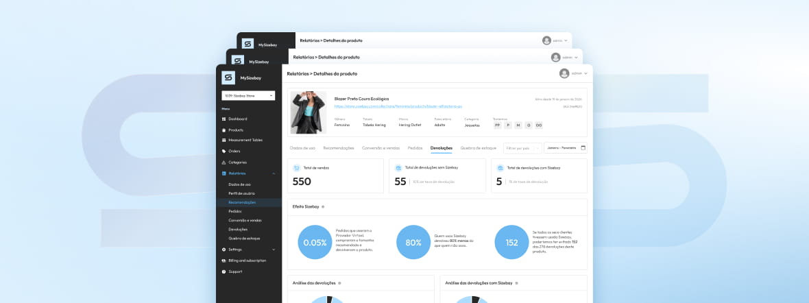
A working size curve strategy combines six habits: dual-layer tracking, mismatch diagnosis, return-pattern reading, external trend monitoring, fit intelligence, and a fixed review cadence. Here’s how each works in practice:
- Track both layers of data, not just sales. Pair demand signals (browsing, size chart checks, cart adds, waitlist signups) with friction signals (returns by size and reason, bracketing behavior). Sales alone shows only what you already captured.
- Diagnose the direction of the mismatch. Compare what you stocked against sell-through velocity and against demand signals that aren’t capped by stock. A size that sold out fast with high waitlist activity was under-bought. A size that moved slowly with low engagement was over-bought.
- Read your returns by pattern, not by volume. A spike in “too small,” “too large,” or bracketing each points to a different fix. Treat every return the same way, and you’ll keep applying the wrong one.
- Layer in signals from outside your own store. Body composition trends, silhouette shifts, and category-wide demand changes show up in the broader market before they show up in your sales history.
- Close the loop with fit intelligence. Size recommendation data, visualization tools, and return data each tell a different part of the story. Used together, they turn the size curve into a live picture rather than a once-a-season report. Our fit intelligence overview breaks down how these tools connect.
- Set a review cadence, and act outside of it when the data demands it. Most categories need a full curve review at least once a season, but a mid-season spike shouldn’t wait for the next planning cycle.
Related: 9 Essential Key Performance Indicators for Fashion E-Commerce
Why You Should Treat Your Size Curve as a Living System
Your size curve is a running read on your customers, not a static spec. The longer you go without checking it, the wider the gap gets between what you stocked and what shoppers actually wanted.
Getting it right means looking past unit sales. Track what people browsed, what they abandoned in cart, which sizes came back and why. Track whether they trusted your size chart enough to buy once instead of ordering two sizes just to be safe. Sales numbers only show you what your stock allowed to happen. The rest of the data shows you what customers actually wanted.
It also means watching what’s happening outside your four walls. Bodies are changing. Style preferences are shifting. Your own sales history won’t catch that until you’re already a season behind, a lag that shows up clearly in both the GLP-1 usage data and the return-rate trends NRF tracks year over year.
Finally, size recommendation and try-on data pick up on hesitation and intent before a sale happens. That’s the real shift: from reacting to your curve, to staying ahead of it.
Ready to see where your own size curve is under-bought or over-bought? Book a walkthrough of how our fit intelligence platform layers demand and friction signals automatically, so you’re not stitching this analysis together by hand every season.